agency-all-logos-(1)-2")
Riman Accessibility Plugin
Purpose & Philosophy
The Riman Accessibility Plugin was created to give every visitor—even those with low vision, dyslexia, motor impairments, or cognitive challenges—the power to adjust a site’s appearance on the fly without needing to install a separate browser extension or change their operating system settings. Its guiding principles are:
-
Empower the End User
Instead of forcing all visitors into a single, one-size-fits-all layout, Riman hands control to each individual. They can tweak text size, contrast, spacing, and more to suit their unique needs. -
Non-Intrusive Design
The plugin’s floating ☰ toggle and panel never alter your theme’s templates. They sit on top, invisible until clicked, and when in use, they only affect the main content—never the control interface itself. This ensures that people always know where to find and how to use the tools, even after they’ve adjusted the rest of the page. -
Single-File Simplicity
Everything—PHP, CSS, and JavaScript—lives in one PHP file. No extra asset folders, no external scripts to load. That means lightning-fast performance and straightforward installation, with zero dependencies on jQuery or external frameworks. -
Real-Time Adjustments
As soon as a visitor clicks a button, the change is applied instantly, without a page refresh. They don’t need to reload or navigate away to see their new font size, high-contrast mode, or hidden images. This immediate feedback is key to a positive, frustration-free experience.
Who Benefits from Riman?
-
Low-Vision Users
Individuals who require larger fonts, higher contrast, or more spacing between lines to read comfortably. -
Dyslexic Readers
People who find certain fonts, spacing, or alignment styles difficult may benefit from increased letter spacing, a simplified “readable font,” or the ability to remove distracting images. -
Cognitive & Attention Challenges
Features like the “Reading Mask” help focus on one block of text at a time, reducing cognitive load and minimizing distractions. -
Motor Impairments
Keyboard access (Ctrl + Alt + A to open/close) and large click targets on the panel tiles let people with limited dexterity navigate quickly. -
Language Learners
The simple, uncluttered interface can help non-native speakers focus on readability by toggling fonts, zoom, and spacing. -
Anyone Who Prefers a Customized View
Even if a visitor has no diagnosed disability, they may simply prefer a high-contrast scheme at night, or they might want to hide images to speed up reading on slow connections.
Getting Started
-
Activate the Plugin
After installation, activate Riman Accessibility Plugin from Plugins → Installed Plugins in your WordPress Dashboard. -
Configure (Optional)
-
Go to Settings → Accessibility in the sidebar.
-
Adjust the following to match your site’s design or branding:
-
Panel Background Color (e.g. white, light gray)
-
Toggle-Icon Background Color (e.g. site-primary, brand color)
-
Toggle-Icon Text Color (contrast-optimized)
-
Active Button Background Color (color used when a feature is “on”)
-
Feature Label Text Color (color for the small text labels under each icon)
-
Heading Highlight Color (outline color used when “Highlight Titles” is toggled)
-
Toggle-Icon Size (enter a value between 24 px and 200 px; default is 48 px)
-
Fixed Position (choose where the ☰ icon—and its panel—will appear:
top-left, top-center, top-right, middle-left, middle-right, bottom-left, bottom-center, or bottom-right).
-
-
Save your changes. If no options are modified, sensible defaults are used (white panel, blue toggle icon, bottom-right position, etc.).
-
-
Visit Your Site
On the front end (any page or post), you’ll immediately see a circular ☰ icon in the position you chose (bottom-right by default). That is your gateway to the accessibility panel.
Step-by-Step User Experience
1. Opening & Closing the Panel
-
Click the ☰ Icon
A single click on the floating ☰ (hamburger) icon will cause the Accessibility Preferences panel to slide open directly next to that icon.-
If the icon is in the bottom-right, the panel appears just above it.
-
If the icon is in the top-center, the panel appears just below it, centered.
-
-
Use the Keyboard Shortcut
Press Ctrl + Alt + A anywhere on the page to toggle the panel open or closed. This is particularly helpful for users who prefer keyboard navigation or can’t use a mouse easily. -
Click “×” or Outside the Panel
-
Clicking the “×” button in the panel header closes the panel.
-
Clicking anywhere outside the panel (on the page content) also closes it.
-
2. Navigating the Panel Layout
-
Panel Header
-
On the left is a bold heading: “Accessibility Preferences.”
-
To the right, you see:
-
A Language Drop-Down (EN, FR, ES). Choose your language, and all button labels immediately translate.
-
A Close (“×”) Button to collapse the panel instantly.
-
-
-
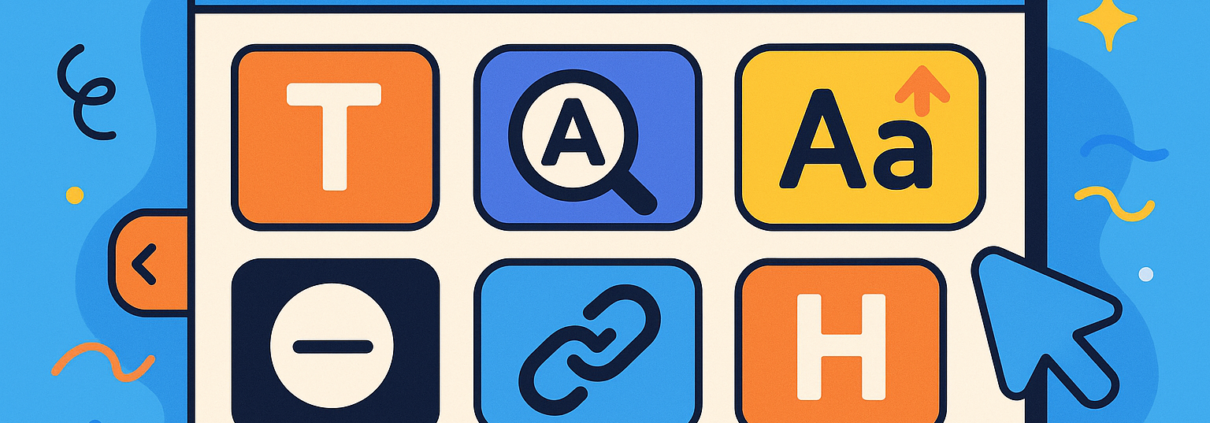
Grid of Feature Tiles & Controls
The main section is a 2-column grid of square “tiles” (or small panels for numeric controls). Each tile contains:-
A simple icon (e.g., 🌓 for High Contrast, 🔗 for Highlight Links).
-
A label underneath (e.g., “High Contrast,” “Highlight Links”).
-
If a tile is “active,” its background changes to the Active Button Color you chose in Settings, and its icon/text turn white for clear feedback.
-
-
Scrollable Content
If your browser window is narrow or the grid grows (e.g., future feature additions), the panel becomes vertically scrollable. You can simply swipe or scroll inside the panel to reach hidden tiles, preventing any features from being inaccessible on smaller screens. -
Reset Button
At the very bottom is a full-width Reset button. Clicking this immediately removes all applied accessibility changes—returning the page to its original design—and closes the panel.
Detailed Feature Descriptions & Usage
Below is how each tile behaves from the user’s perspective. As soon as you click a tile, you’ll see the whole page transform instantly (except for the panel itself, which stays fixed).
1. Reading Mask (▭)
-
Icon: A narrow rectangle (▭)
-
Label: “Reading Mask” (or its translation)
-
What It Does:
-
First click: Two semi-transparent black overlays appear at the top and bottom of the viewport, leaving a horizontal “window” in the middle (about 40% of the screen height).
-
This “focus band” highlights only the text currently centered on screen, dimming the rest, which can help readers track line by line or paragraph by paragraph without distractions.
-
Second click: Removes the overlays and returns the page to normal.
-
2. High Contrast (🌓)
-
Icon: Half-moon (🌓)
-
Label: “High Contrast”
-
What It Does:
-
Toggles a strict black-background, white-text scheme across the entire page.
-
All background colors become pure black (
#000), all text and borders become pure white (#fff), overriding any existing theme styles via!important. -
Click again to restore the site’s original color palette.
-
3. Font Size Control (↓ / % / ↑)
-
Icon Area: A small row with a “▼” button, a percentage (e.g., “100%”), and an “▲” button.
-
Label: “Font Size”
-
What It Does:
-
Decrease (▼): Reduces font size by 5% per click (down to 50%)—the label updates (e.g., “95%,” “90%”).
-
Increase (▲): Increases font size by 5% per click (up to 200%)—the label updates (e.g., “105%,” “110%”).
-
Immediate Feedback: Headlines, paragraphs, menu text, captions—every text element except the panel’s UI itself—re-render at the new size instantly.
-
Excludes Panel: The controls themselves remain at a stable font size, so you never lose access to the buttons.
-
4. Line Height Control (↓ / % / ↑)
-
Icon Area: Same row structure (▼ “100%” ▲).
-
Label: “Line Height”
-
What It Does:
-
Decrease (▼): Decreases line spacing to 50% per click (minimum).
-
Increase (▲): Increases line spacing to 200% maximum.
-
Visual Effect: As soon as you click, the vertical space between lines of text expands or contracts—helping readers who need more leading between lines to track text more easily.
-
Panel Stability: The control’s own line spacing never changes, so the panel remains readable.
-
5. Letter Spacing Control (↓ / % / ↑)
-
Icon Area: (▼ “100%” ▲)
-
Label: “Letter Spacing”
-
What It Does:
-
Decrease (▼): Shrinks letter spacing down to 50% (narrower).
-
Increase (▲): Widens letter spacing up to 200% (roughly +2 px at 100%).
-
Reading Aid: Widely spaced letters can help readers with dyslexia by making individual characters more distinct.
-
Panel Remains Unchanged: Only page content letters shift spacing.
-
6. Content Scaling (Zoom) (↓ / % / ↑)
-
Icon Area: (▼ “100%” ▲)
-
Label: “Content Scaling”
-
What It Does:
-
Decrease (▼): Zooms the entire page content down to as low as 50%.
-
Increase (▲): Zooms content up to as high as 200%.
-
Broader Adjustments: This is effectively a site-wide zoom that works on images, videos, and all elements—not just text.
-
Panel Exclusion: The plugin forces the panel itself to stay at
zoom: 1 !important, ensuring you don’t accidentally shrink or enlarge the controls.
-
7. Readable Font (✎)
-
Icon: A small pencil or “✎”
-
Label: “Readable Font”
-
What It Does:
-
Toggles all textual elements (headings, paragraphs, menus, widgets, etc.) to use Arial, sans-serif (or your chosen fallback).
-
Many users with dyslexia or low vision find sans-serif fonts significantly easier to read.
-
Click again to revert to your theme’s original typefaces.
-
8. Align Right (↦), Align Center (↔), Align Left (↤)
-
Three Separate Icons:
-
Align Right (↦)
-
Align Center (↔)
-
Align Left (↤)
-
-
Labels: “Align Right,” “Align Center,” “Align Left”
-
What They Do:
-
Single-Click Activation: When you click an alignment icon, all content (articles, paragraphs, sidebar text, etc.) immediately re-flows to that text alignment via
text-align: X !important;. -
Toggle Off: Clicking the same icon again removes the alignment rule, returning to the site’s default flow.
-
Mutual Exclusivity: If you click “Center” and then click “Right,” the “Center” effect is removed and “Right” takes over. Only one can be active at a time.
-
Use Cases:
-
Some readers with specific visual or cognitive needs prefer left-aligned text.
-
Others, for languages like Arabic or Hebrew, might want right alignment.
-
Centered text can be easier to track for short blocks (e.g., poetry).
-
-
9. Hide Images (🖼️✖)
-
Icon: A small image icon with a “✖” overlay
-
Label: “Hide Images”
-
What It Does:
-
Instantly hides all
<img><picture>and inline<svg>elements on the page by settingvisibility: hidden !important;. -
Users who want a completely text-only view—perhaps to reduce cognitive load, improve reading speed on slow connections, or minimize distractions—can toggle this on.
-
Click again to show images as normal.
-
10. Highlight Links (🔗)
-
Icon: A chain link (🔗)
-
Label: “Highlight Links”
-
What It Does:
-
Applies a bright yellow background behind every hyperlink (
background-color: yellow !important; color: #000 !important;). -
This makes it crystal clear which words or phrases are clickable, benefiting users with low vision or color blindness.
-
Click again to return links to their theme’s default style.
-
11. Highlight Titles (H)
-
Icon: A bold capital “H”
-
Label: “Highlight Titles”
-
What It Does:
-
Draws a dashed outline (
outline: 2px dashed {your highlight color}) around all heading tags (<h1>–<h6>). -
Users can quickly scan to find section headings, improving navigation for screen readers or those who skim content.
-
Click again to remove the outlines.
-
12. Reset (Reset)
-
Icon: None (full-width button labeled “Reset”)
-
Label: “Reset” (or its translated equivalent)
-
What It Does:
-
Clears All Classes & Styles
-
Removes every
html-*class (e.g.,html-high-contrast,html-reading-mask, etc.). -
Deletes all dynamic
<style>blocks that were injected for font size, line height, or alignment. -
Clears any inline
letter-spacingorzoomproperties from the<html>element.
-
-
Reverts Everything to Default
-
Any toggles you clicked (e.g., High Contrast, Hide Images) immediately turn off.
-
All text, colors, and layouts return to exactly how your theme originally presented them.
-
-
Closes the Panel
-
The panel automatically closes, so users know they’re back to the site’s normal view.
-
-
Step-By-Step: Typical User Flow
-
Spot the Icon
-
A circular ☰ in the lower-right corner (by default) signals “Accessibility Tools.”
-
Its familiar shape and color contrast (e.g., dark blue background, white icon) draw attention without obstructing content.
-
-
Open the Panel
-
User clicks ☰ or presses Ctrl + Alt + A.
-
The Accessibility Preferences panel slides into view, anchored next to the icon.
-
-
Select a Language (Optional)
-
In the panel header, the user can switch between EN, FR, or ES.
-
All labels immediately translate, helping non-English speakers.
-
-
Toggle a Feature
-
Example: A user with mild low vision clicks the “Font Size Up (▲).”
-
Immediately, all page text becomes larger (e.g., “110%,” “115%,” etc.).
-
If they prefer dark mode, they click “High Contrast (🌓),” and the entire page flips to black-background, white-text.
-
-
Adjust on the Fly
-
If the user wants to focus on just one paragraph, they click “Reading Mask (▭).”
-
Two black overlays appear, leaving a bright strip around the center. The user scrolls down to move that focus window.
-
They can adjust “Line Height” for extra breathing room between lines, or widen “Letter Spacing” to help identify individual letters.
-
-
Turn Off/Reset
-
When finished or if they accidentally over-adjust, they click Reset.
-
Everything—fonts, colors, masks—returns to baseline instantly, and the panel slides closed.
-
-
Continue Browsing
-
If they revisit another page, the plugin remains active with their custom settings intact until they click “Reset” (or reload).
-
They can open the panel on any subsequent page to toggle features on/off again.
-
Why This Matters
-
Compliance & Inclusion
-
Many organizations must meet WCAG 2.1 AA or ADA guidelines. While a fully custom theme might require extensive code changes, Riman offers an out-of-the-box, client-side solution that empowers users without altering theme templates or CSS.
-
By giving control to the visitor, you’re not just meeting minimum requirements—you’re demonstrating genuine commitment to accessibility.
-
-
Reduced Support Overhead
-
Instead of responding to individual “I can’t read your site” tickets, you can point visitors to the universal ☰ icon and say, “Click there to adjust the page to your liking.”
-
No need to bake dozens of custom classes into your CSS or launch a second “accessibility version” of each page.
-
-
Improved Engagement & Retention
-
Users who struggle to read or navigate a site tend to abandon it quickly. Riman’s immediate adjustments—often within seconds—help keep readers on your content, improving dwell time and reducing bounce rates.
-
-
Flexible & Future-Proof
-
If tomorrow you discover another accessibility feature (e.g., a “dark mode” toggle, a “dyslexia-friendly font” option), it can be added as another feature tile and corresponding JS handler.
-
Because the entire plugin is encapsulated in one file, updates are straightforward: overwrite the old version with the new one, and features appear instantly.
-
Technical Summary for Developers
-
Single PHP File:
-
Contains all plugin logic, CSS, and JavaScript—no separate asset files.
-
Hooks into WordPress actions:
init(load translations),admin_menu+admin_init(settings),admin_enqueue_scripts(color picker),body_class(position class),wp_head(CSS), andwp_footer(HTML + JS).
-
-
Dynamic Styling:
-
Creates three
<style>blocks in<head>for live updates:-
riman-dynamic-font(font‐size) -
riman-dynamic-lineheight(line‐height) -
riman-dynamic-align(text alignment)
-
-
-
Interactive JavaScript:
-
On
DOMContentLoaded, the script:-
Grabs references to all feature tiles, control tiles, and the toggle/close/reset buttons.
-
Binds click handlers to toggle classes on
<html>(e.g.,html-high-contrast) or update dynamic<style>contents. -
Monitors clicks outside the panel to auto-close.
-
Listens for Ctrl + Alt + A to toggle the panel via keyboard.
-
-
-
Admin Settings Page:
-
Accessible under Settings → Accessibility.
-
Uses WordPress’s
settings_fields(),do_settings_sections(), andregister_setting()APIs. -
Employs the built-in WP Color Picker for selecting background, label, and highlight colors.
-
Sanitizes user input to prevent invalid hex codes or out-of-range icon sizes.
-
-
Internationalization:
-
All static strings in PHP are wrapped in
__()oresc_html__()with text domainriman-accessibility-plugin. -
JavaScript also uses a small
translationsobject for the three built-in languages (EN, FR, ES). -
To add more languages, drop in a
.mofile under/languages/and extend the JS dictionary with the new language code.
-
Summary
-
Open the Panel
-
Click the floating ☰ or press Ctrl + Alt + A.
-
-
Adjust on Demand
-
Toggle high contrast, enlarge fonts, hide images, outline headings, apply a reading mask, or zoom the entire page—instantly and without reloading.
-
-
Maintain Control
-
The panel itself never changes size. Even as you increase the site’s font to 200% or zoom to 150%, the controls stay the same—ensuring you never lose access.
-
-
One-Click Reset
-
Return to the original look and feel immediately by clicking Reset.
-
-
Designed for Everyone
-
From low-vision users to keyboard-only navigators, from non-native language learners to those with cognitive challenges, Riman Accessibility Plugin offers a robust toolkit that encourages inclusive, barrier-free browsing.
-
By placing these controls directly in the hands of your visitors—without modifying core theme files—you create a truly accessible website that respects each person’s individual needs. The Riman Accessibility Plugin is not just a compliance checkbox; it’s a commitment to letting every user decide how they see and engage with your content.